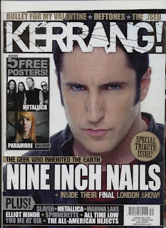
 Kerrang! Nine Inch Nails special:
The cover uses a single, medium close up of 'Trent Reznor' (Lead vocalist of 'N.I.N/Nine Inch Nails')
I felt the design was based around a basic colour scheme as their font colour and background so the reader gains more a focus to Trent and there for judge him into a categories of stereotypes.
My initial first thought to this cover was spending a couple of brief seconds figure out the facial expression. His expression made shows the aggression and disappointment seeming moody almost showing resemblances to the attitude produced into the bands music.
N.I.N is a Nu-metal band created in the 80’s, they were one of the first bands to produce this type of genre of music.
From past annotation on Kerrang! the creation of NIN was near the time of the creation of Kerrang, in which Kerrang could have been one of the major steps to rejoice their reputation and get them where they are.
The headline show a similarity towards other fonts used on the front cover, “Kerrang! and “NINE INCH NAILS”. They have common similarity such as the Kerrang masthead has a black box surrounding it while the NIN title has an invisible border. Both texts are formatting to each typeface seem like they would appeal to a niche audience and form a particular stereotypes of reader. Both pieces of writing have white writing so they stand out and don't calibrate with the images chosen.
To draw people into buying the magazine, they use words such as “Special issue” a technique to lure readers in and gain information no other magazines can provide they can provide the news before other magazines proving that they want to be number 1. From noticing this I gathered a thought that it would be linking to the past and present of NIN and discuss the history.
Another instant draw is the feature of having “Special issue” in promotion to major news that Kerrang have got their hands on shown on the right hand side of the cover. A main key difference is that its a 'Tribute issue' so initially saying its the end and they are celebrating the success.
The design used for this is evenly sectioned so you can identify the spiky shape indicating the tribute issue. Once I noticed the shape I felt as though it was shaped like a medal.
In a urge to get more people to buy they the reader is given “5 free posters”. They adversities the 2 most popular bands in this case 'Paramore' and 'Metallica', with a caption of other promotional posters, with other captions saying and more only written small so the headlines don't seem over powering and the main point of the issues is lost.

The front cover design only uses a particular colour chart of which all coloures merge together and calibrate to have a clean straight to the point intake. The chosen colours seem cold and would be avoided unless it was looked at the niche target audience the colours used are :
* Neutral gold- 'Special tribute issue'
* White- 'Masthead and Headline'
* Dull grey- 'Graphics to promotional poster offer'
The hybrids of this issue are line on the left with other bands featured in the magazine, some of which have a different font colour to stand out more and to become more important in the issue. In doing this it gives the reader an open mind to what other features they will be in this issue only spread through the various pages.
-Metallica- (All bands are the white highlighted ones on the hybrid) Their lead singer 'James Hetfield' is in a small featured of question and answer on his favourite activities near the front pages. Another reason why they are highlighted could be because of the free poster and to the fact that it is show on the front cover.
-Elliot Minor: One of the live bands featured in the issue. At the time the issue was made Elliot Minor were still new so this was a great way to gather a bigger audience and give a small opportunity into promotions.Also feature at the end of the magazine in the gig section so people can go see them if they liked the review.
-All Time low: Talked about in the news section, with a brief section written about their new track making number 4 in the American chart list. This again is a good chance for people to listen to them and go see them.
-The All-American rejects: Featured near the end of the magazine of question
I felt that if these bands were mentioned then they would get more publicity and if the reader look at the gig guide near the end of the issue then they would could consider Kerrang as a reliable source to go see featured bands and keep reading.
-Bullet for my Valentine + Defotones: These two bands are sectioned together because they are both feature on a one page spread. However what separates theses bands interviews is one is an exclusive report and the others a catch up on their new album, further information includes touring and the 2009 experience.
I think overall the editorial team have used 3 colours because to reflects N.I.N’s genre of music. The Nu-Metal rock band, is well replicated in cold metallic colours showing a patterned link to silver or show this as how they used to shine and now their Carree is nearing an end the colour is fading. The is used as Kerrang’s but is used in the headline so it can be an instant draw. where as gold is used for to represent wealth, and can be associated with being great and coming first.
On the magazine some of the font is untidy and looks erased to again link to the niche target audience. The chosen font can be found on the headline and masthead “+ inside their FINAL London show! It’s unique on how final is highlighted to show an end of an era. The font from here looks scratched to again show this link towards the music and the Kerrang logo.
The use of neutral colours shows the underground scene of music and wrap a genre around it. This means neutral colours are used to show that there is no defiance into rock because there are loads of separated genres linking creating parallel scene just a different name attached. , Kerrang devises into all the genres such as Metal, emo punk.
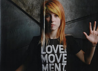
Even the posters given out show a dark side and replicate this niche audience .For example the poster set designed for Paramour hosts lead singer Haley Williams get set behind a dark background substantially looking grim and show a draw towards her bold t-shirt. The actual background is set to become dark and dingy almost showing a new side of the music produced by her band, however the florescent coloures of her hair show this innocent look and show her trademark style up lifting the image.
In the other cover shot poster Metallica’s picture is shooted in black and white, most likely to get people to gather the stereotypes that their an old heavy metal band and show this darkness.
Trent’s picture show attitude towards anger and is again a reflection to NIN’s music. The caption gives the reader confusement and encourages them to read more and find out his past shows his . “The Geek who inherited the earth”. The caption makes the reader want to get to know the key behind his locked up past.
Overall this cover is meant to show NIN's voicalist Trent is the main focus and the music falls into the importance catergory, Kerrang use's word's such as exclusive to encourage people to read the magazine and understand the whole story start to finish. The dullness of colours make it seem like its a funeral setting and an upsetting time so they use a limit of colours. 70% of people will only buy a magazine because of an intresting cover. This cover can only appeal to past readers of Kerrang, or mainly NIN fans because of this farewell issue. The bonus of getting poster proves the value for money and the evident of the picture and exclusive makes it sound like its a bonus and their holding vital news for people that they desperately want to read.
No comments:
Post a Comment