
This was my first picture I deeded to take, before I took it I had to make sure that the image became clear and had enough space so that could fit in mini headlines.
With this image it works quite nicely. The only problem I have with this image is that there is not enough facial expression, but I think so far this is the best image to used because of all the space surrounding it, giving me the chance to add in headlines.
As you can see I have added my music magazine title to see what it will look like in comparison to the other picture and to see which image will suit best.
This image was a close up of one of the pictures I had taken earlier. The reason for the close was so that I could get more facial expression, I wanted this mainly because then I could use a good headline for the band, and show there aggression of being locked out referring the name. Personally I don't think this picture Will work because there is not going to enough room and all my side headings will cover up the image making it look messy and over crowded.


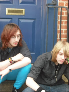
By now I was wanting to get some different images, instead of always constantly having Matt bang on a door. The problem is that in this picture it doesn't have the aggression, it looks more like boredom. If I was to have this a my magazine cover I think the only used it would be is if the band were near a spilt situation because there facial expressions show disappointment. The picture has loads of space but I want the picture to represent the band name and not look like they are bored.
I was recommended that we should actually have a locked door in which it shows a good meaning towards the name. I don't like this image so much because of the sign on the door, and that you don't see much of Matt and again Dom now looks depressed. I don't think this image would give me enough space and the random coke bottle in Matt's trousers ruins this picture as well.
Once the images were taken me and the Boys had a quick conversation on what image would be best. They both recommend that I use either the close up or the picture where they are both sitting down. the reason being because it gave me space to used different font sizes and gave more space to add titles.
I think I will experiment a little bit more with my images, such as changing the colour to see if it gives it a better effect.


No comments:
Post a Comment