Friday, 29 January 2010

front cover

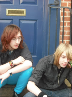
I have recently taken pictures of Mat and Dom for my front cover. Because of the band name "Locked out" I thought it would be a good idea to get the boys in front of a locked door but showing some kind of anger/disappointment to the lock on the door.

This was my first picture I deeded to take, before I took it I had to make sure that the image became clear and had enough space so that could fit in mini headlines.
With this image it works quite nicely. The only problem I have with this image is that there is not enough facial expression, but I think so far this is the best image to used because of all the space surrounding it, giving me the chance to add in headlines.
As you can see I have added my music magazine title to see what it will look like in comparison to the other picture and to see which image will suit best.


This image was a close up of one of the pictures I had taken earlier. The reason for the close was so that I could get more facial expression, I wanted this mainly because then I could use a good headline for the band, and show there aggression of being locked out referring the name. Personally I don't think this picture Will work because there is not going to enough room and all my side headings will cover up the image making it look messy and over crowded.


By now I was wanting to get some different images, instead of always constantly having Matt bang on a door. The problem is that in this picture it doesn't have the aggression, it looks more like boredom. If I was to have this a my magazine cover I think the only used it would be is if the band were near a spilt situation because there facial expressions show disappointment. The picture has loads of space but I want the picture to represent the band name and not look like they are bored.


I was recommended that we should actually have a locked door in which it shows a good meaning towards the name. I don't like this image so much because of the sign on the door, and that you don't see much of Matt and again Dom now looks depressed. I don't think this image would give me enough space and the random coke bottle in Matt's trousers ruins this picture as well.
Once the images were taken me and the Boys had a quick conversation on what image would be best. They both recommend that I use either the close up or the picture where they are both sitting down. the reason being because it gave me space to used different font sizes and gave more space to add titles.
I think I will experiment a little bit more with my images, such as changing the colour to see if it gives it a better effect.

Wednesday, 27 January 2010

The treament

My magazine "Rock Star" is a weekly Rock magazine set for young teenagers. Its going to be sold monthly because this will save people money instead of spending more money every week.

The magazine will appeal to both genders because its easy to form. The people that star inside will be new bands, around from local areas, and people that are trying to make it big. Some times t will feature well know bands but I might use these bands for one off issues. However it will have the famous bands inside it's just that they wont be the main topic of the magazine. The main ideas I want people to get from this magazine is that it introduces people into new music, and help new bands make it famous.


Themes and typical features:

Features inside the magazine will include interviews, gig details, and live shows, I will also include a poster offer Evey 2 weeks. The sale value will be £2.75 for every month, this being an average fair price. I have now thought that the magazine would become a better adaption to be featured on the kerrang! website as a free online magazine.

Topical conversation involved the magazine will people views on gigs, recommendations on what good bands are out there. I think this magazine will be a good way to introduce people into unknown bands so this will get their popularity up. This can also be used to my advantage because I think a poll every 2 months will let the reader get their opinions out and this would be a great way to improve the magazine.

Typical features will involve the poster offer, using this as a bit of fun, also a free CD that has the new bands on so it gives the reader a chance to know if you like them or not.

The magazine Will be A4 and will have approx 45+ pages depending on how many bands a month we could find, and what advice we have . I'm thinking that having a weekly help from a well know band eg "30 seconds to Mars" in a questionnaire in what made them turn to music, who inspired them, and what advice they have for people that want to turn to music for a Carree


potential advertisers:

My magazine will introduce new bands, so I think my main adverts will be mentioning further education towards music, record dealers and how they can get you in high success, band concerts/gigs, places where you can buy good instruments. For example in the adverts case things like "Aloud.com" a ticket sale company, "gear4music.com" sells instruments, "EvoMusicRooms" record company.

I think having companies like that supporting my magazine will increase people buying it, this being that its know for helping people get further with their music, great on advice on what you need to become a world famous band, and an introductions towards new bands.


Editorial Team:


The people running the magazine will be people already in bands, and have close contacts to new bands some even local and see if they have what it takes to be featured in next months magazine.

I would prefer that they are young internes and have a good experience in English so that the interviews, cover stories, and gig reviews. I doing so im hoping that it would become a sauces and it will want more people to join bands, go to more gigs, and lsten to new music.

This will get the rattings up and increase in the profit.

Monday, 25 January 2010

Interview

It's rare these days to stumble across a new sensation of an all male rock band who already know they have made it big.
Puzzled by this? I certainly was. Drawing back to the days where Slipknot were know as 9 idiots in masks with people embracing the fact they had no talent. Well having have a recent 10 year anniversary I guess, the jokes on the people that didn't believe they could make it big.
Trying to make themselves a band I was joined by 2 of the band. "Locked out." Matt Barton and Dom Cowels two Shropshire boys know only by the music they play and the great entertainment they provide.
Entering the room you would think the world's next break through band would do all they could to create the perfect song and get started to creating it. From what I set my sights on it was highly doubtful. If you were to enter the room yourself you would have thought it was a place to dump your children from the havoc they created. "Can we get this over and done with. Cowels moans, I have a lot to get on with". With Dom getting agitated I turned my head to notice Matt gleaming at his nails looking around the room. Obviously in an uncomfortable position, it didn't help that it was to be their first major interview.
This child like behaviour included moments of the boys pretending to attack each other with their instruments, to me this seems rather quite funny and no physical harm was done showing they have a close relationship towards each other.
So lets start off on the pleasant side off life, in questioning where did you find the inspiration and time to form a band? Is it true that you feel you can make it to the high ranks of fame in the click of your fingers?
Matt seemed like the dominate leader, with no hesitation answering my questions one by one. "I can remember from a young age I was always passionate about music, my parents bought me a guitar when I was 6 and forcing me to play and never give up because I will never get anywhere in life."
I then turn my head and have a quick glance at Dom giving him a look on insisting him to answer my question. He slowly looked up and answered shyly, " I suppose I got into music when I was 10. walking by a music store begging my parents to buy me a guitar. The problem being we didn't have much money and my parents said the sentence all children dread...No! If you want something so bad then you have to earn a living to buy it for yourself.
Of course being at a Young age I threw a fit and smashed everything in my room, I can then remember turning my music up full blast and screaming along to the lyrics. From then onwards I can remember that every time I got in a mood the music would increase and the singing to calm me down came out.
I permanently got into singing by a simple mistake, this is the way it goes, got in a mood at school had my MP3 sat in the corner and sung, this being coincidental in a music lesson. After which my teacher mentioned of music lessons after school in which I took up singing such as joining the choir. Me being me I denied that and she then offer that I should at least take lessons and from there on I never looked back".
The story bought a shock of surprise to me, and made me and the boys sit in silence for a moment or 2, then the lads grinned at each other "We both met in college and we knew that the college were looking to form a band, they gave us a try out and noticed that e and the other lads had a great chemistry and announced that we would be the band.


How did such an odd name come to mind?

The lads both grin and fall to the ground in fits of laughter, as I looked at them fall to the ground now crying in hysterics. As they rose they instead that the other one told the story of how it came to be. "My girlfriend sent me a text years back clamming that she was left outside the house, her mum had gone shopping. She didn't have a key to the house her phone battery was almost dead, it was snowing and she wasn't wearing the most sensible clothes. I knew this from the text in capitals saying "I HAVE BEEN LOCKED OUT SIDE MY HOUSE, I HAVE NO KEY, ITS SNOWING AND I'M SO COLD..AND TO MAKE THINGS BETTER MY MUM WONT PICK UP HER PHONE!!!! CAN YOU HELP IN ANY TB LY xXx


From this I was devastated and in the end she waited and her mum came to pick her up. The following day, me and Matt were asked to think of a name, as we sat there I was looking back on my old texts. Then it came to me I can remember sitting up and shouting out 'LOCKED OUT.'


The album 'Give me 10 reasons why I should let you borrow this CD' is their first and yet will it stay that way. Looking back at their history the boys have never been on the same side and have always had their consent arguments 'I hated his guts at one point in life, he really drew the band apart and always saw himself as number one. It was brutal I couldn't cope but I knew that we can only get good music with great expectations and then I knew we had to solve our separate ways.
Barton sights his anger towards Cowels and looks ashamed at saying that to, after that bitchy comment was created they lads once again apologised to each other and told me 'In a time like this we need the band to be as one.' (THIS COMMENT WILL BE ENLARGED UNDER ONE OF THE PICTURES SO THAT YOU GET A PREVIEW INTO THE INTERVIEW)

I heard that the both of you were bought up in Shropshire (know as a small commune town). I have heard random descriptions from other people and it sounds like a bore. Has this had any effect in the music you produce.


The boys just shake there head, of course this confused me a little what part of the question was being answered. "We have been living in Shropshire all our lives, and like we said we know each other from college however our up bringing never really put us into the musical direction. I would have to say my pure inspiration was when I was sat watching Kerrang! T.V. and there was a new band playing. After the song finished we got an exclusive interview with the band, they said they grew up from a difficult home town. Their parents abbused them so they had music to solve their issues. As soon as I knew it I sat there, and realised that if I try to play an instrument then I can make it big like the band." Matt then grins picking up his guitar to play.
"Shropshire isn't the best up bring, when I came into my teens I was very depressed and my parents were near breaking point. To calm my anger like I said it was me singing, and boy did that pay off. Our first ever live show was in my girlfriend's hometown 'Clun' and yes I have to say it was a very dull place almost matches your description of Shropshire" Dom chuckles.


The majority of the songs sound like they were past memories towards your lives. "And maybe someday you will grow Maybe someday you will know Maybe someday you will end these tears
A little piece of me grows old I keep on walking down this road I've seen a million people change but I will stay the same And I know you, (Know you, know you) always steal and borrow And I know you, (Know you, know you) Never catch, you're never gonna catch tomorrow". Was this linking towards a bad relationship.
In such triadic cases the world is neither a pleasant place for your band or all that surrounds it. To Matt and Dom it seems the world is their playground and yet they still know what they are doing and seem to produce top quality music


"Never catch?" Explain


Bad relationship (Sigh), I had announced that I was going to be in a band and she simple said if that was going to happen then the fame and success would rise to my head.


I suppose really when you join a band the worst is just around the bend.


Exactly but I have someone new, and she respect's the demands that music have such as my constant gigs but the way she See's it is, she gets free tickets all the time and shes very happy with that. The lyrics are staying that in the end, anything you are desperate for you're never going to get/catch as I wrote down the lyrics.


Are the majority of your songs about this one relationship that went down hill.


No just the one song the others are about, well I guess Dom turns to Matt to think what the right words are to say. Matt fishes Doms thinking towards the track listings "They can have mixed reviews people can either love us or hate us but that will never draw us to a close


The album was know to be created in Matt's back garden with the help of his parents. I question the boys and they both grinned at each other and simp. A peculiar place to have a CD made but I huess its early days and thinks could be looking up. These boys know what they are letting them selves into, with a near split its almost as if they have been to hell and back.


After they have a little laugh about the story of it being Matt they explain the funny side of it, passing me a free copy of the CD I sill don't understand the funny side of it all. "To be honest nothing really is that funny its more of the case of the amount of fun we have had doing this in my garden. Into the latye of night just thinking of random songs and listening to previous artists for inspiration. The main funny side of it was the time we got dunk." Matt turns to look at Dom and again the laughter starts, they were really antogsisng me to hear the story. In a desperate measure I ask for the answer. "I cant remember half the story but the first track on our CD was created while we drunk. When the song was created we celbrated and got even more drunk and for some strange reason we wanted to see if we could have a guitar battle. In which we woke up to smashed up instruments and a burnt down house.

Friday, 22 January 2010

Images for the contents page

I had the great idea that I could put an image of 30 seconds to Mars newest CD This is War...but then I found out that I wasn't allowed to do this because it wasn't my idea and would. I was recommend that I make my own CD cover but not to spend too much time on this.
I remember that in Media as one of my course works I had to make a album for a pretend tour so I think I can use this to my advantage.
When I think of some new ideas I shall write them down. If I cant find many pictures to add to the contents page then I think I will add one big picture of a single shot and add it to the right and then have all the information on wha is availbe to the left.

For my interview I shall first write it in rough post it to my blog and get some opions on the work and then start to design my page. My interview is going to be asking Matt and Dom what they have done to make it this far, how the near spilt has effected them. Just like the second double page spread of 30 seconds to Mars I too might do a litle time line, the problem being I dont know what information I will have to use.

Wednesday, 20 January 2010

Live gigs

These pictures will be for a section in my magzine where im writting a live review. The actual images are from a gig I went to. It was In Birmingham In October it was Bowing For Soup 'Party in your pants tour 2009. This was one of the guest acts Zebra Head. I have added these pictures baecasue they are in good quality annd im really proud that I got that close. All the other pictures I took were too blurry and not very good and these are the best ones.


Fonts

These are the fonts that I have selected from Dafon.com, I am now going to be calling it Rock star. The reason in this choice is because it's simple, it advertise what music is mentioned in the magazine and doesn't drag on like "Hell! that's a lot of music.
Instead I am now thinking that will be my little caption such as Kerrang! having "Life is loud. The problem is I don't know if I want to design it in a basic text, my chosen font or something completely different.
So far from I looked at these were my favourite Because they seem similar to Kerrang! and that's what I want mind to be like. I think I will try my other names to see what they look like.

At the moment my 2 favourite would have to be the second image, and the last font. Once you zoom in you can understand why.
It goes along with the whole broken text, like its been smashed up and shows the loudness of the music.like the first one is a bit too basic and reminds me off paramore's logo .
It would be good it I could edit so that I can make it into different colours again just experimenting so I will try and give that a go.

Tuesday, 19 January 2010

Interview pictures

Pictures

These are the pictures I took of my friend Matt (The one holding the guitar) and My boyfriend Dom.
The reason I chose these two in my pictures is because they have a great relationship with each other, and are always doing the most random of things.
However I was recommended that these images should be used as an interview section and not the front cover. For my front cover I was told to get the boys so that they were purposely posing, and that I should set it that it has a better atmosphere. This being because the images I took look like the boys were in the middle of creating a studio album.

This was the first I took, I was thinking of having a single shot of just Matt and Dom's guitar. To improve this I can change it so it becomes black and white giving it an old fashioned look. I find this image could have been useful for a front cover because of the clear background and then way Mat is positioned near the middle giving me space to write my sub headings.


I don't think this image will work because it seems to blurry and not in focus. It doesn't help that Mat isn't looking and Dom has no idea what is going on.
Even for a interview page I don't think it shows a high standard of what I want.


I think this image will work nicely. Being because it shows Mat hard at work for their CD. The way the light from the flash of my camera has given it a better standard. I think if I was to add this picture I think the small caption would be "Men at work Mat Barton working hard" or something like that.


This image would have been useful to use, if Dom was actually looking at camera. I think I will have too add something like this into the magazine otherwise its just going to end up pictures of Matt while I'm talking about his no existent band mate.


This image can be seen as humours or as aggression, I see it as humor because I know when this was take by me it was meant as a joke. If I was to add this picture then I think to make it seem like a joke I will put a funny caption.


This picture is not the best. I suppose if I was only interviewing Matt. How ever I don't think it will work so well because he isn't looking at the camera.


This is defiantly going to be put into the magazine because its shows them having fun in the creation of their new CD. It also gives me a chance to discus the stress or problems they have had in creating it I could even mention a near split situation. I suppose I could use that threat put onto the cover so that it draws more readers.


This picture can only be good it showed more of Matt and that you could actually see their facial expressions. I think some of these pictures I may edit so that they are more eye catching and draws more people in.


This is the second part to the picture Where Dom is being silence by Matt. I more prefer this version and will consider using this in the contents page.


Monday, 18 January 2010

Weekly review 2

Weekly review:

At the moment (when this was written) I have lost my energy. But I have started comparing other magazines to one another. My in focus is to base my mag like Kerrang! Only to make things more personal and detailed.

For next week my goals are to start taking pictures writing about them and do a layout for my magazine, scan them my designs in and write about them. Then think of what I can do as an interview. As usual the weather held these things on hold but so far it looks like things are going back to normal. Hopeful none of this should be a problem.

Again put in a situation where I am about to go to sleep, this time Sunday 11:50PM Ideas start to hit me.

I have all my media written and saved to my memory stick. But then I thought of what I’m planning on doing for my photo shoot.
I’m nearing tot the stage of creating the front cover and to think of a name.

For no reason I remembered my boy friend telling me he was watching ‘South Park’. Then I had a random moment where I thought I haven’t seen a certain film in ages. On this occasion it was South Park the movie.
While thinking of the film I was thinking of what can I do about the title for my magazine? I knew that I didn’t want a basic name such as “Rock weekly”.
Then what do you know my favorite song of song of South Park the movie popped into my head ‘Little Boy your going to Hell’.
I knew I didn’t want a simple title and then suddenly an idea came to mind.
HELL!’ For a magazine title but I wanted to add a little extra then this came to mind... ‘HELL! THAT’S A LOT OF MUSIC/ROCK’. (I haven’t decide which version I like best).

After looking around my mess of a room I noticed my DVD ‘Viva La Bam’ then I thought ‘Viva la ROCK!’
Before I knew I saw energy drink on my floor and then thought of the energy drink ‘Rock star’. After this I remember ‘Oblivion by 30 seconds to Mars and I thought that would make a good tile.

I will soon decide what title is best suited my magazine and I guess if it wasn’t for my boy friend Dom then none of these ideas came to mind.
I just hope that my ideas don’t come when I’m about to go to sleep at the end of the week because this is happened 2 times in arrow and its really starting to get annoying.

Kerrang 30 seconds to Mars issue 1281


30 seconds to Mars issue number 1281 released 3 October 2009

To begin with the only reason I’m doing another Kerrang! double page is because I’m taking most of my inspiration from them and I though it would be a unique idea if I did a small review on a double page on when the new editor running the magazine.

Starting from page 24, do I like what I see at the moment the opinion is no existent.
Over looking the pages they discuss 30 seconds to Mars’s new CD and their law suit with ‘Virgin records’.


It seems that the majority of the interview is a look at the past and the law suit. the CD “This is War” doesn't show a great appearance in the shots taken (From the page I was reviewing all of them were medium shots).
The images taken have made it look as if the everyone has unclean faces like they have stuck their head in the ground.
If I was in charge of the images I would get the boys to either to be in some sort of war scene or pull fighting poses. When I turned the page I noticed the was a giant image over taking half the page (Unnecessary) Jared is cupping his hands over his face to show the pressure so I assume that it relates to the pressure of Virgin records.

The black out page spread had various images almost like they had made it in to a story line. I’m aware not all images on interview’s can be the same but I think that some should have some relation towards what the topic is on about. the pictures on the black out had a range of different shots while 30 seconds to mars hardly have any pictures and really don't show any emotion and take up allot of the paper.
Pointless lines are highlighted but to me they don’t seem epic enough to be pulled out .
The only decent part of the interview/page layout is the mini time line on the left side of the page, personally that's the only thing I can say I like about it.

“There were many, many fucking brutal days, says Jared Leto we were dragging through the ringer. It was not easy fight.. This is what happened: the group were being sued by EMI (Virgin music’s parent company”.)
Personally all I can say is FOR FUCK SAKE! This interview is so lame and its not even mentioning anything new. Of people would get frustrated if you were being sued you would be pissed off you got sued for no reason.
But it’s to the fact the constant mention of the suing i always mentioned and not enough details about the new CD.


Q


These are only brief notes on Q being so is because I don't want to base min too much on Q.
Q magazine seems like an sophisticated magazine, it seems like its best suited for musicians, adults, or people really passionate about music. I think also that the magazine will talk to blue, Indy and rock bands.

Issue number 279 released August 9 2009

Colours: Red seem rich and can seems like a powerful colour because of it being so vibrant. Its a stand out colour so it can not be used to often.

* Dress code: In issue the issue I have chosen (Muse) the main singer Matt is dressed smart/posh. Because of it being older readers the pictures have a high quality.
While in Kerrang! the bands dress in glad rags that look high street quality. In this issue the clothes look smart expensive and almost like it has some relation to business.

*The magazine starts well know people E.G. Cheryl Cole, Lilly Allen and all these have had great success rate

*The interviews are more personal, other than Kerrang! who explain basic things such as what's happening then and there. I think Q will be more detailed and adult so will used words that cant really appeal to younger people because it wont make sense. I think it will also talk to the bands and ask them personal questions so they can show the reader what it takes to show success and what to become famous in a band really needs.

Questionarie

For my magazine I will need to make it have certain qualities to it such as the price range and the genre toward it.

What Genre should the magazine be?

*Rock

*Metal

*Indi/Blues

*modern things E.G. people in the top ten charts

*New bands

*A mixture

How much should the magazine be priced at?

*£1.00

*£2.00

*£3.50


When should the magazine be relesed?

*Weekely

*Monthly

What bands should be featured?

*New bands

*Well know bands

*Local bands

*All of them


What gender should the maagzine appelae more to?

*Male audiance

*Female audiance

*Both

What age group should I target it at?

*13+

*16+

*20+


What free gift should I give out?

*Posters

*stickers

*CD

*None

Friday, 15 January 2010

The top magazine's information

Kerrang! Q NME Metal Hammer Rocksound


Weekly Yes No Yes No No


Monthly No Yes No Yes Yes


Price £2.20 £3.90 £2.30 £4.95 £3.60


Quality Paper Gloss Paper Gloss Gloss


Give aways Poster, Unknow Some Some times Posters sometimes CD’s, times posters,CD's Stickers and sometimes Gifts stickers


Name meaning Guitar chord, Cue music, Heavy metal, underground music,New music express

Personal review
Kerrang!: To me Not worth the money £2.20 a week altogether £11 a month, and that's without ordering it throught the mail.
In my eyes they are not the best at explaing what the main story the majority of the time during interviews they only say what the band are doing while being questioned. Also an occasional comment on the CD release.
The poster are annoying because they are now a days repeats of bands featured week after week. The pages are wafer thin, and doesn't give an important info. They show live bands but again only have explanations on what the crowd are doing.


Q: It seems grown up and complex. The picture standard quality is bold and iconic. the cover is what I class as glossy, has a shine to it and isn't paper thin. It gets to the point in interviews and shows great inspiration towards an artists/musician.
They only interview the best of the best, and not just random new come bands these bands are mainly popular and chart topping bands.


NME: They focus on pop rock bands. I feel this is suitable for pre teens (Kids going into their adolescence years). Like Kerrang! they sell the magazine every week and their material status is paper however unlike Kerrang! the pages are even thinner like a newspaper.
The magazine its self holds loads of information mainly on what CD’s are on release, interviews on what route is set out for their future career.
I can remember I owned some NME magazines in the past, “The Mighty Boosh” took over. Inside the magazine it seems really over crowded and is layered out like a newspaper, so that could be the reason why they have made the pages so thin.


Metal Hammer: From the title it looks at all the genres of metal. Again has a glossy cover and it too has a high class professional shots. The magazine does introduce new bands. The magazine to me seems like it’s set out for die hard fans/people that take great passion into their chosen scene


Rock Sound: Rock/Rock pop are clased into this magazine. Gloss and it's sold monthly to me the magaine seems like a Kerrang! It's the way everything is represented almost exactly the same, such as the page structor.


Tuesday, 12 January 2010

Kerrang! contense page

Kerrang! contents page-A comparsion of editors Issue number 1197 released February 16 2008


When released this was produced by Paul Brannig, I was begging every member of my family to buy me this issue of Kerrang! because of the main band featured was 30 Seconds to Mars.


You have the editors comment on the headline band in the contents page. In the case of this issue he's describing what pure deviation to a band is "WOULD you travel half way across the world to see your favourite band? 30 Seconds to Mars fans do".


This point is then proven when we look into the interview and all his notes are explained "...has 30 seconds to Mars tattoo on his arm." "A Denmark couple have travelled to the UK for six dates of this tour. This they say will cost them at least, 5,000 Euros."
Later on the editors notes gives a small promotion of the Kerrang! Relentless energy drink tour.
Altogether the contents page has:


*2 live pictures
*1 magazine cover
*1 poster offer/(In their case icons)


*1 CD cover
*1 Letter of the week image (Again mentioned like that because it's not an interview
*3 news pictures

All these pictures are sectioned off in to the relevant topics they combine with. Kerrang! has also made it have a clear background so that the font colour does not have to change. If this was done then you would have too many distractions, and them seem confusing and over crowded.

Flicking through the magazine I have noticed that these pictures are best suited due to popularityof the bands and the stories that are being told. It's very odd that the still that have actions descrbing the situation images (In one case violence) they again have a clear indoor backgound. So when sorting out my pictures I will rember to look into that but then again experiment and see if a colourful backgorund makes the image seem over crowded and too busy therefore making the reader get distracted that they give up looking at it.

The main contextaul colour used on this page layout is yellow and balck. I think these colours are used on this page layout becasue it reminds me f a dnager sign E.G. High voltage. Yellow and balck are used because It's bold and seems like an eye cathcing statement is made. I have another theroty of why this is used, High voltage comes to mind when I see the colours and people can assume It's related to high power like on amp of a guitar this can then be traced to the titel Kerrang! becasue It's apprently a gutiar chord.

I really like the design and the way everything is split into sections, such as the way they laybel a band under a subject (Shown on the right). "Features page 22 30 seconds to Mars, Page 27 Plain White T's, Page 41 BloodSimple." This seems short and snappy and saves having to explain each setion and why they are featured

Kerrang! Issue num 1281 Released October 3 2009


I don't want to buy a magazine where a giant picture is over taking half the page. There is personally no need at all of this, and what makes it even more pointless is to the fact that they don't even play a major role into what was happening that week.
Also 2 small images are squashed into the giant picture and one of them isn't even related to something really important. Also the reader can just flick through the magazine right at the end and find out who's featured in the random question game.

There is a new little logo put by some of the bands named as Cover story, I think is there any need for that. They don't even give you enough information on why the are made up as cover story. For example Features-page 22 20 seconds to Mars: Jared and co come back fighting. Leaning into their new CD this is war, but if people are fans of the band and where unaware that they had a new CD out how are they suppose to understand the joke. When simple you could have mentioned it was an interview.

She has used les images and as said gives it a huge image to over crowd the page. The big picture its self doesn't eve look very professional and to me the layout is really not my taste.

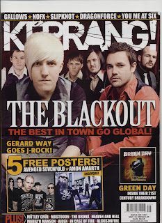
Kerrang! The Blackout double page spread


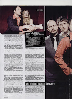
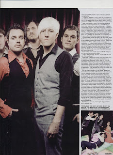
Kerrang! The Blackout double page spread page 26-27 Issue num : 1261 May 16 2009

In every page spread you always seem to have various captions mainly ones that describe a bands emotional past, and the making of their new/ recent CD.
They often are half of a sentence, swearing is commonly used to make it see edgy. In this case “Lets get fucking steaming! The blackout.”
The border outline towards this is black on white and this can seem like its relating to Misen en secne towards the title of the band.

On the page spread out it give the reader a brief history on the band mates opinions, in this case what success forming the band has done for them. “I’ll know I’ve made it when...” Above the picture they have an image of the band members and a random model (Used as a extra) giving their speech on what success is for them.
In another picture a hand is been shaken as i a life changing contract has just been made. Misen en scene is used and also seems stereotypical by the way everyone dress smart. To show this with the contract owner, is wearing the classical business mans suite pinstripe suite.
It then uses a random catchphrase but has moulded it to fit in the sentence, “Deal or no deal, err that’ll be a deal then“.


To me the band are dressed smartly because it shows their hope for great success for their new CD.
The best in Town” is the name of the new CD so to reflect this the main image is used because the phrase worlds best is assumed, you do something better than anyone so the colours used are to represent the band name and the clothing in representation of smart and higher success in life unlike others.

Other images on the interview seem like a timeline based on stereotypical way the saying “Sex Drugs & Rock ‘N’ Roll” when faced with these images.
The use of money shows the greed between one and another so as I mentioned seems stereotypical. Soon the image changes to wealth over friends, and then the struggle in a relationship.

I have recognised these images in the certain shots
-Page 24 Sean, and Gavin (Title in on page) is a group high angel shot
-Page 24 the girl and the main focus being money is a low angle group shot
-Page 24 Sean (Blond haired guy) looking left eye line shot
-Page 25 The man with all the money (Held in a fan shape) Medium shot maybe even close up
-Page 25 Sean and the girl faced backwards Medium long shot

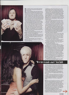
Finally going back to the page I am analysing the small image in the right hand corner shows the fall out and the greed of money. I think this also shows the chaos that this album has to have and what it has caused. This shot is in a medium group shot to get all the action.

Above this image is the only piece of text that is created in bold to stand out, THE ALBUM THE BEST IN TOWN IS OUT ON MAY 25. THE BAND-PLAY THE DOWNLOAD FESTIVAL IN JUNE. SEE GIGS FOR DETAILS.
This technique is to promote the CD, and can also be claimed as a way to get more readers into the magazine. In this case mentioned there are pages dedicated for Gigs, people can then find the Black out or other bands and go to gigs. After that transaction is made they can then feel that Kerrang is reliable and carry on buying because of that benefit.

Reading into the interview you as the reader delve deep into the Blackout’s new CD. “THE POINT at which pop finesse meets punk power, the best in town-which opens with a track called ShutTheFuckuppercut, should you require another statement intent-was recorded at sonc Ranch studios in El Paso, Texas with the help of producer and former ‘A’ front man Jason Perry.”
You get an inside look into the new CD and who helped produce, but an extra bonus is a mention of another band. Magazines tell the reader deep details to save research, in doing this it convinces the reader to save time.

Magazines layout out the text so that its boarded in groups and centred. To make a paragraph they make a indent and leave 2 small spaces. To create a new subject, but they have made it clever as if a new start as well as the paragraph “TODAY IS the morning.

To inspire me for magazine after my contents page I'm going to do a quick snappy recap on the band such as mentioning their new CD and then adding the odd quote after my telling of how it came to be. This quote will involve their opinion/emotion and work through the process.

Rock sound

Rock sound: 30 seconds to
Mars, issue num 109 released May 2008


The next magazine I have annualized is “Rock Sound.” A monthly magazine priced at £3.60. The free give away in this magazine is a free CD in nearly every issue and sometimes posters and stickers. The CD offers tracks of new CD’s soon to released and new bands.

RockSound uses the slogan “New music first”, this is even underlined to make it seem like a statement and they consider it factual.
Unlike Kerrang! Their font styling is basic; to me they look like they are trying to mimic Kerrang! with the broken scattered font. Only Rock sound only do it a little at the edges and not in the whole section of writing.

In the monthly issue that i bought features the American band 30 seconds to Mars. The band are made up of
-Jared Leto: Lead vocalist, and now guitarists. Jared is an actor, directs some of the bands music videos. Jared and the band have recently been in the news due to Virgin records suing them because of a broken contract.
-Shannon Leto: The drummer and Jared’s brother who has been making music with Jared from a young age.
-Tomo Melvic: Lead guitarist, Tomo is a recent addition to the band.

I found it odd that some of the font was hand written such as “the long road out of hell...The untold story”. I had another discussion with my mum on why this could be. We said it was written in the form of hand writing to make the reader feel as id it’s their own personal story all the way.
I also think that the reason the writing is highlighted in florescent yellow because it’s to make it stand out and doesn't merge into the background.
What can make this seem really effective is the section told as “The untold story” where this has a black border behind it. This could be used to draw you in and seem like it’s an exclusive and quite sub focal.
Other subheadings that have yellow backgrounds, these include “WIN!” written in skeptical text, another way to put the readers focus on the reason to invest in buying.
Then you have “150+ Release reviewed-including...” They say 150 to boast they have lots more to interest you, to me the circular shape is used makes it look like a sticker, as if it’s recently been put there and looks very stylish.

The 30 seconds to Mars logo is laced at a medium height, your eyes neither have to look up nor then down to know what bands are featured.

As Usual Jared is put as front man and is doing an odd pose, in this case as if he's preying which goes very well with the headline toiling with hell.
i think the clothes director has picked out Jared a blue anorak coat to make him stand out the most, and I find it really reflective the way the collar is sticking up and his cheek bones are sucked in.
While Tomo and Shannon however are dressed in black and really merge into the background. Tomo (Left of Jared) hairstyle has dramatically changed, and so has Shannon’s appearance. I have only put that point in because it seems un natural that Shannon hasn't shaved and Tomo hasn't straightened his hair, again this is most likely representing the title given, showing their exhaustion of getting out of hell.

The magazine cover looks slightly messy and un-organised, this is because of the small image of Matt Tuck (Lead vocalist of Bullet for my Valentine) “Bullet for my valentine-party hard in the USA.” To me the image seems pointless and has no relation to a big party atmosphere the title is giving out.
Giving some of the sub headings a ripped effect seems to be based around a stereotypical punk style. Where as Bullet for my Valentine are a heavy metal band so to me it doesn't combine very well and the white background and makes it seems a little aluminous.

I like the strap lines across the banner giving a description of why they are featured, also the way all the colours combine as one.
-”The offspring + Finch”: Its clever how both are combined into one topicThe punk rock heroes return”.
- “Paramore On the record”: This can assume a new debt album will soon be released, another small tease into making people buy the magazine.
-Nine Inch Nails-Reznor reveals all: Its almost as if there's something that has never been told, and all that's stopping you from finding out what the story is about is you buying the magazine.

The weirdest title is “Math Metal the ultimate guide,” you wonder how such a subject can arise. Deep light blues are used to blend and contrast the yellow, its to calm the yellow down. The yellow writing “Win” is my main focoual point then once the colour toned down I noticed the price.

Another subheading is again to show what bands are feature in the monthly issue. “Genghis Tron, Parkway Drive, Filter, Goldfinger, Cult of Luna, Trice”. These are written in white and bold. Its he way they are oddly highlighted and again uses the same text as the main title.
The other bands mentioned include “Cancer bats, Panic at the Disco, The Audition, Brigade, Tetament.” Thee bands however are fronted in small font size and I have also noticed that the bands in blue are more famous than the ones written in white. Could this be a way to promote the unpopular bands.

Weekly review

Weekly review

So far I have been off college due to bad weather and have had one to many distractions. At the moment the time is 3:01 AM Sunday 9Th January crazy time to up date your log (Or written in the rough at this time NO JOKE!)
I'm aware this is irrelevant to media but I have just finished watching a film “Requiem for a dream” . By the end of this I was over powered and had various thoughts of insanity. I suddenly soon remember that I need to get work done and plan the rest of my work.

I can remembered talking to Caroline about what things I should start on for this task. Get pictures for the contents page.
The film in it’s self really shocked me both emotionally and mentally, after which gave me deep thoughts. This leading me to think of my work.
At that point my mind went blank...and then the ideas came pouring in. I knew if I didn't write them down they would disappear and they would never come back again.
Some of my main ideas I came up with was the pictures and locations and some of my staplines, headlines and overall cover story


Idea 1: Gather a group of people and get them to pose behind a white wall. Then upload this picture to photo shop and create it so it becomes dark and unknown . Then I remembered most people merely pick up magazines because of the band. With this I would write the cover line “Delve deep into the unknown!”

Idea 2: Get people to smash up instrument or stop in mid motion of destroying them this photographed in either a medium close up or a long shot. I would gather long shot because you can get more of the surroundings and understand the situation.

Idea 3: Get group shot, of people to dress in a certain scene E.G. emo. Only photographed in a medium close up so that they can be a focal point

Headings

Using the website “Dafont”. I will pick a variety of texts that I like and experiment with them change the colour to see what works well. I may only use a certain font that looks decent and stick to a limit for headlines. Of course the main think I need to keep in focus is making the title stand out and have all other fonts submerge into one another.


Strap lines are one of the key features in magazines as it gives the reader information on who will be featured. I created various strap lines, most of them connected so that the magazine is organised and not have random unrelated bands.These are just some of the strap lines I will use for some of the featured bands.
Kerrang! created quiet a big issue with the death The rev (Avenge sevenfold drummer), sales increased and with that in mind it will draw people in, and make everyone wonder what caused his death and what memories he bought. The memory will be good to bring a certain target audience if I choose correct headlines to appeal to this then it shall be a success.


*The Rev-AX7’s final farewell

*Rev’s final sending
*Things will never be the same
*Another soul for the dammed
*An end of and era


A recent gig I went to will be reviewed tour dates and a weekly gig. In my case the featured band would have been bowling for soup (The pictures are not great quality) so instead 'Zebrahead' the support band will be reviewed. Bowling for soup and zerahead are some what hybrid however they still shar simlar links and a are a good format to use. Ways to involve bowling for soup would be to ahve them featured at the top section of the magazne gutter between other bands.

*bowling for soup...Britain's new craze
*B.F.S. Hit the UK
*Soup’s up B.F.S in the UK
*U.S wonders hit the UK’s Birmingham


Other tags that might be used could include a price give away, however the size of the caption is vital as it may over crowd the main image and loose focus. All the bands are ones that I have seen making it easy to relatle to the experiance. It also creates a hybrid reaction getting the audiance into a mixture of bands.
*WIN
*Prize give away
*Competition of the year


Other banner titles could be a small metion of some sort of review of the year and a topical metion of bands
*2010 wonders
*2010 low down
*What's atrocious, misunderstanding, what's up in 2010

Main headings


These are some of the random ideas I had come up with at the time, I didn't have a name for my band I had to be careful on what I said because the main story hadnt been decided
*Delve deep into the unknown
* **** Britain's new band
*Who are the guys...read on to know on
*Newsiest found

Confirmed strap lines (Just unsure which are the best)

*30 seconds to Mars
*Rise Against
*Placebo
*Blink 182


-30 seconds to mars:
*The cult, the beautiful lie, the WAR!
*CD review
*Jared’s finest hour


-Rise Against:
*Live
*The hard hitting interview
*An inside look


-Placebo:
*the power of a drug, the beauty of a “Battle for the sun”
*Hot Stuff
*The last we know off?


-Blink 182:
*Reunited
*Tour 2010
*The boys are back in town


Reason’s behind the titles

30 seconds to Mars

* ‘The Cult, The beautiful lie, the WAR!’ I have created this because it’s based around the 30 Seconds to Mars Echelon cult. Where fans of the band share thoughts and opinions towards the band. The section quoted the beautiful lie is relating to their seconds debut album titled ‘A Beautiful lie’. The next part ‘WAR!’ is in a promotional creation discussing the new CD.

* ‘CD Review’ purely no explanation, a review on their latest CD.
* ‘Jared’s finest hour’, I know from some where I have heard the saying finest hour but have never really know when it can be used and now I do.

Rise Against

* ‘Live’ makes the reader know that there is going to be short review/ questions or even just a getting to know one and another interview.

* ‘The hard hitting interview’ not linked to the first idea but always a good way to make the reader assume that and emotional and hard hitting story is about to be told a good way to draw people in.

* ‘An inside look’ making people think it’s all access pass

Placebo

* ‘The power of a drug, the beauty of a ‘battle for the sun Promotional way to release the CD.

* ‘Hot Stuff’ Tagging along the lines of the CD title

* ‘The last we know of ?’ Spreads panic through a reader luring them into to knowing what’s going on.

Blink-182

* ‘Reunited’ After a 5 year split. This will let people buy it to find the cause to the spilt and the regain.

* ‘Tour 2010’ Gets the reader involved and shows them what things this magazine has in stall

* ‘The boys are back in town’ an old song used as a joke to show their reformation.

All these ideas will be pictured and updated ASAP. Thanks to 'Requiem for a dream' none of these ideas would have sprung to mind and there was a song that dedicated to stay up longer and jot this al down. I'm glad I have got everything over and done with that I can do for now ending this at 3:53 AM feeling sleepy but proud I have a good chunk of work written.
Times are only relevant to the rough hand written version and not the one that has been added to the bog (I have just written what I put ).