• In what ways does your media product use, develop or challenge forms and conventions of real media products?
Student magazines are aimed at one audience, teenagers they are mainly put out to give advice on careers because they are heading in that direction and half the time have no idea what is out there so the magazines are used as a guide into the future.
On the magazines they all included help/advice and some times even the mention of famous teenage celebrities to draw the reader in. The typical content in magazines are careers, driving and the dangers that surround teens.
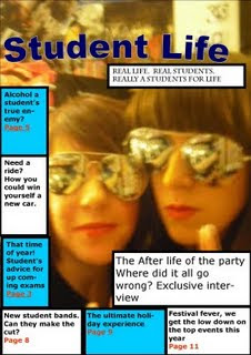
To include this I have created my magazine cover main topic to be based around party's and drinking. Usually on original magazines they would have the writing scatter on the image with no border however I couldn't do this because my picture has different colour tones so some sections you could read the writing while other parts it was very difficult to read. Although I did find it a bit awkward to read this .
.
The difference I have made to this is trying various ideas, such as making the headline go horizontally, this was not a very good idea, but I though that at least I tried and showed the development.
As you can see from my magazine cover the main features that you need is some sort of main topic/gripping story to shock the readers.
• How does your media product represent particular social groups?
The way that I have made my magazine show the typical gender and social groups is by aiming story headlines that relate to teenagers. Such as talking about drinking a common subject that is mentioned. I would say that I my main audience was teenagers, and if was based around students then it would be talking about Carree advice and to me this is what I think separates people from reading the magazine it seems rather boring.
I do feel that I have represented teenagers well, this is because of my photos that I have used and some of the stereotypical topics that are commonly used to represent teenagers are used as my headlines and stories.
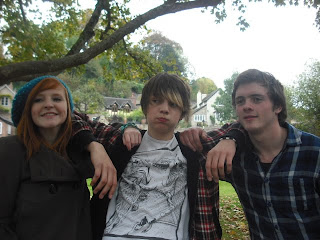
I chose the image of me and my friend Alice because its lively and I thought it would have been an easy topic to talk about. If I had used one of my other pictures then I don't think it was have been very good. For one thing not many of them were medium close ups, and I would have to edit them. Also I didn't like it to the fact that no one was paying attention so it made it look a bit awkward.
I struggled on writing on my picture because of the lighting. No matter where I wrote only certain lettering showed up, and I found this to be very annoying. So I went back to my research and decided what colours appeal to both genders and what do student magazines have as there colour scheme.
That's where I came up with idea for the blue boxes, I found from research that its lively vibrant colours combine with either 1-3 other bright colours and then natural. I think this is because the page would look to busy and over crowded and then you have no sense of direction, as in you don't know rat to read first and then you get bored.
• What kind of media institution might distribute your media product and why?
I think the company's that would invest or take ideas from my magazine would most likely be the college. I think its similar because those were the two magazines I studied the most and I have taken some of their ideas.
I think they would want to use my magazine because its based around teenagers, and the world of students. Most magazines if they are not written by students seem very in your face and seem a bit stereotypical and start blammoing everyone or just giving advice for the next steps in life.
• Who would be the audience for your media product?
Age? Gender? General profile of your audience?
The main audience for the magazine as I have said would be either students/teenagers. Mainly teens because I didn't want to base it all around getting jobs and finding a career. The main reason of this because when I read magazines talking about jobs it seems really pressuring and a bit dull as if I was being nagged.
• How did you attract/address your audience?
What did you include in your mag to make it attractive to your target audience? Spend some time discussing the front cover – remember this is the hook that makes people buy it (70% of people buy their mags on the spur of the moment) Think also about mode of address – how does your mag “talk” to the audience. Why would someone want to buy your magazine?
I think the main thing that lures people to buy my magazine is the image. Just like any other magazine people look at the picture first to assume they like it. They give a brief look at the headlines and to see if it becomes any interest.
Because it called student life I think my picture catches people, due to the fact that me and Alice look like the image is meant for a music magazine. Most teens are into music so I though this would draw people in.
Student magazines are aimed at one audience, teenagers they are mainly put out to give advice on careers because they are heading in that direction and half the time have no idea what is out there so the magazines are used as a guide into the future.
On the magazines they all included help/advice and some times even the mention of famous teenage celebrities to draw the reader in. The typical content in magazines are careers, driving and the dangers that surround teens.
To include this I have created my magazine cover main topic to be based around party's and drinking. Usually on original magazines they would have the writing scatter on the image with no border however I couldn't do this because my picture has different colour tones so some sections you could read the writing while other parts it was very difficult to read. Although I did find it a bit awkward to read this
 .
.The difference I have made to this is trying various ideas, such as making the headline go horizontally, this was not a very good idea, but I though that at least I tried and showed the development.
As you can see from my magazine cover the main features that you need is some sort of main topic/gripping story to shock the readers.
• How does your media product represent particular social groups?
The way that I have made my magazine show the typical gender and social groups is by aiming story headlines that relate to teenagers. Such as talking about drinking a common subject that is mentioned. I would say that I my main audience was teenagers, and if was based around students then it would be talking about Carree advice and to me this is what I think separates people from reading the magazine it seems rather boring.
I do feel that I have represented teenagers well, this is because of my photos that I have used and some of the stereotypical topics that are commonly used to represent teenagers are used as my headlines and stories.
I chose the image of me and my friend Alice because its lively and I thought it would have been an easy topic to talk about. If I had used one of my other pictures then I don't think it was have been very good. For one thing not many of them were medium close ups, and I would have to edit them. Also I didn't like it to the fact that no one was paying attention so it made it look a bit awkward.
I struggled on writing on my picture because of the lighting. No matter where I wrote only certain lettering showed up, and I found this to be very annoying. So I went back to my research and decided what colours appeal to both genders and what do student magazines have as there colour scheme.
That's where I came up with idea for the blue boxes, I found from research that its lively vibrant colours combine with either 1-3 other bright colours and then natural. I think this is because the page would look to busy and over crowded and then you have no sense of direction, as in you don't know rat to read first and then you get bored.
• What kind of media institution might distribute your media product and why?
I think the company's that would invest or take ideas from my magazine would most likely be the college. I think its similar because those were the two magazines I studied the most and I have taken some of their ideas.
I think they would want to use my magazine because its based around teenagers, and the world of students. Most magazines if they are not written by students seem very in your face and seem a bit stereotypical and start blammoing everyone or just giving advice for the next steps in life.
• Who would be the audience for your media product?
Age? Gender? General profile of your audience?
The main audience for the magazine as I have said would be either students/teenagers. Mainly teens because I didn't want to base it all around getting jobs and finding a career. The main reason of this because when I read magazines talking about jobs it seems really pressuring and a bit dull as if I was being nagged.
• How did you attract/address your audience?
What did you include in your mag to make it attractive to your target audience? Spend some time discussing the front cover – remember this is the hook that makes people buy it (70% of people buy their mags on the spur of the moment) Think also about mode of address – how does your mag “talk” to the audience. Why would someone want to buy your magazine?
I think the main thing that lures people to buy my magazine is the image. Just like any other magazine people look at the picture first to assume they like it. They give a brief look at the headlines and to see if it becomes any interest.
Because it called student life I think my picture catches people, due to the fact that me and Alice look like the image is meant for a music magazine. Most teens are into music so I though this would draw people in.
• What have you learnt about technologies from the process of constructing this product?
From this I have learnt how to create blogs, I have learnt a little bit more on publisher, and coral paint. This has become very handy to get the magazine cover that I wanted. I already knew about some of the programs available such as coral. The trouble was that some times the computer would not let me process the images I had to use publisher however using publisher made learnt how to add different effects.
 I also learnt how to use the scanner and upload images such as the Etc magazine. I didn't use a digital camera because I already had the images but this project has tough me how to recognise certain angels of the image such as medium close ups.
All together I have found this project a bit of a challenge such as up dating my blog and meeting deadlines. I really happy that if I wasn't able to meet a deadline I would set my self the task to complete ti and try and get a bit more done. Personally I have really enjoyed it and I have gain new skills in completing my magazine cover.
The hardest part I found was finding information on what is available on the market already, and getting ideas such as the front cover and what topics should be included.
If I could improve anything/start again I think I would have do some more compassion and find some ore images. I also would have liked to think of more cover story's and know most of the magazine terms off by heart.
However I have really enjoyed my self and I'm very Happy with the end result.

No comments:
Post a Comment