Thursday, 9 December 2010

Evaluation on music magazine

In what ways does your media product use, develop or challenge forms and conventions of real media products?
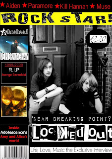
My magazine was created to compete with the popular market of rock magazines. My main inspiration was from Kerrang! and I followed some of the conventions that I noted from this magazine such as a large masthead, strapline and a range of coverlines. I took some ideas from Kerrang but the challenge was to have more vital information than Kerrang so that my magazine would be more atractive than its rival.
Being the first issue of my magazine I wanted to make it stand out from others on the market I did this by deepening the aspect and changing the colour. The audience would be intrigued by the low price and the fact that it features teenagers in their own bands to become the next featured artist.
Other conventions include the strap line having bands not many people would have heard of. This would get them into new bands and the magazine provides information about them and includes a gig guide so if the a band appeals to someone they can check when they are touring.
The final attraction would have to be the mention of a prize give away leading more into reading, which is what can be usually found on a magazine of a particular genre. All these features are used so that my magazine doesn't look any different from other magazines but also creates something new to compete in the world of magazines.


I decided as the final idea I would have the black and white version. This is because you rarely see a limitation fo colour. It seems more grown up and restrics to a certain age limit. By doing this I also challenged the conventions
In the audience feedback I was told this red was too bold and made a statement and was rather distracting. Even though red and yellow are commonly used on music magazines, but because I had loads of information down the side, the writing started to merge into the images.


How does your media product represent particular social groups ?


The age of Matt and Dom represents teenagers and the choice of clothing stereotypes them into an automatic age group. If I had got younger people then I would have to add more pictures and make all sentences shorter so a younger audience wouldn't get bored. Stereotypically the teenagers look bored and moody and this reflects dominant ideas in society about teengers and rock music
The fact I have the male gender on the front cover makes it appeal to a certain audience. The font used was found on 'dafont.com' its not really suited for the image but it does attract. I feel that the red side bar lets the image down because it's too bright and looks untidy.

My magazine is for students and teens, I feel a small improvement could be the fonts and layout. Its too simple and looks like a child has done this subjecting the work down to a different level. Even though the image is good it's not best for front page material but the fact that Dom and Matt are students suggest the stereotype that they are having difficulties with money and the band. A place that the readers can all relate to and see how they dealt with it.

What kind of media institution might distribute your media products and why ?

If created then it would be selected as a small free run in Kerrang!, to get high promotion I would suggest an advert to show people about the cheap price and the link between it and Kerrang! If all sales would be pursuit then I would suggest that a solo sale would be appropriate. My magazine would therefore by distributed by a company like Bauer media group who publish Kerrang
I take the idea from seeing various adverts helping a new magazine to push them in the right direction. If the magazine some magazines you have mini spin off ones so I want to take that idea and put it into a well know magazine. In which the correct age range will read and maybe even subject bands they know into the magazine.

How you appealed to your target audience?

I had reasecarhced magazines that featured simlar topics. in which readers would reconise these simlarites but understand that our magazine had more topics. I felt making a magazine link to others would create a new battel in the market and everyone would have to be top of their game.

Bold colours and niche bands connects to the popualtion that would read the genre of my magazine. Images that were relevant to the magazine hellped dipict who will listen and let people understand the particualr age range.

Who would be the audience for your media product ?


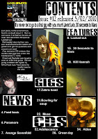
My main target audience is students. I feel the best representation is shown by the image. This is a uni sex magazine, the image can be appealing to both genders. Females may find them attractive while men would want to hear about their experience. Small sections of the maginze would include advice on getting started into a band. This small dedication was represented in the contense page. (The picture is at the bottom, it wont stay in the correct place.) I have listed this as feedback I did this because it was an opportunity for the audience to ask how certain people made it big. If i was to list it under a student guidance I think this would intimidate people and make it feel like a student magazine, so it wouldn't be that popular.


What have you learnt about technologies from the process of constructing this product ?


I had a couple of problems when using photo shop and I wasn't that experienced I had to use the computer program 'Gimp'. While creating my images I again wasn't equipped with the technology so didn't get print screens of my progress.

The main bit of technology I learnt how to use was an online blog, I did have a couple of problems along the way. I realised that I did need to have a wider range of images and to label things more clearly.


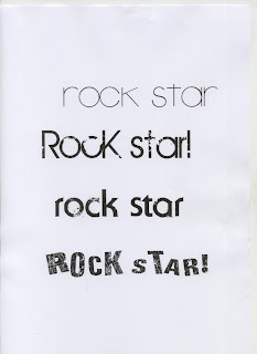
The use of of new computer programs have increased my IT skills not to a higher standard but to an acceptable state. Using Dafont as you can see from the left let me experiment more with masthead and let me have a wider choice of fonts on the final product.

Looking back at your preliminary task, what do you feel you have learnt in the progression from it to the full product ?


I have learnt to pace myself, focus on my goals and follow my plan as best as I could like I said I really wanted to experiment more. I really enjoyed analysing magazines I really liked and this task involved something I took an interest in.
Further more in comparision to my student magazine I feel everything has improved, whether it was using better fonts or doing more comparison towards available magazine it was what I wanted. I think in a case for improvement I could have added more pictures and shown how I expanded some ideas such as taking print screens of my working progress.


One thing I'm not too happy about is the way I used Dafont but never cropped anything. I have learnt a lot and am personally pleased with my end results.

Monday, 22 February 2010

Double page spread designs

This was the first part to my double page spread. I was looking at a recent issue of Kerrang!(Featuring 30 seconds to Mars), and I was getting techniques on how I can link the layout towards my pages. In this issue there were little images but mainly writing. They combine the pictures so that they had enough room to write on them, and because of the pictures having a white back ground they managing to blur the writing into them, unlike me.
This layout was good but the problem was that I had to keep changing my font size just to fit everything in and then it lead to having to create loads of pages until I ran out of pictures.
I was disappointed that I couldn't edit my quotes and make them smaller so that I could squeeze them in and make them fit. If I changed the size then it would become all pixelated so then you couldn't read it.
However before I decide to take some of their ideas I wanted to give the layout a go myself. I thought the first attempt I did was good but didn't seem that professional. Usually before an interview there is a blank page where the write a shot intro of who they interviewed, a small title of the band and maybe a picture. I wanted it so that I had a log interview and not a shot questionnaire. Although I might cut some of my writing out so that it becomes a small interview about the CD.

This was the 30 seconds to Mars influenced magazine. Once I scan in the issue I will make compare notes but I don't think I will stick with the idea because its mainly copy right and none of my original ideas.

However I do like it but I think I might change it a bit more so that it has the 30 seconds to mars issue idea but has more of my approach towards it.

I was told as long as I had one double page spread then I was fine. I will now need to complete my first designs and reform them so that they have columns so that it becomes more like an interview from a magazine and now just rows of writing so it looks too complex. I think the black blue and red work really well for this page and its background. Looking at the first attempt of my interview I would say that for a first go even though I need to complete writing it I feel that it went quiet well.
Things I need to improve on are to figure out how to make my writing is to make it into columns, create a shortened version so that it will fit 2 pages and have all the information I want.


As you can see I need to finish editing this page and have some more pictures. I'm still going to keep the originals but like I said create it into columns, maybe even try making so that my writing appears on my pictures.


This is my final idea. I took my time and created it with getting layout designs from previous Kerrang! magazines.
I think this is the best version and I have actually completed. As said I have cut down my words to fill up one page. In my other versions I had taken a wrong approach, and try to go it alone. Once I looked through old magazines I started to understand what I was doing wrong.
I wanted a clean layout with approite questions and a mini story of their life and how their band was created. My images show the location of their interview (Studio), and I think it has really nice effect. I only just managed to squeeze in a little quote I think an improvement on that would have been to make it a bit bigger, find a bigger place to add it. Then merge it into the background colour.
I only chose 3 basic colours because I wanted it to about the interview giving vital information also it was to base it around the genre of music featured. If I was to change it to a brightly coloured background then I feel it would be far too distracting and almost give the reader an opinion that they are a pop band because of the colours and make it too distracting.
I think I could have repositioned my band logo somewhere else and again make it bold and stand out.
I feel that the readers will think the layout is a bit basic but gives useful advice on the band. Once I had complete this I had to double check my front cover to see if I had featured what I had said about the band, other wise this would be misleading.
Over all I very please with my double page spread, I took my time and personally it really did pay off. I so far have done everything I wanted to improve, such as experimenting more with layouts comparing to the real magazines and giving good information on why the band are featured

Wednesday, 10 February 2010

Contents page

Using dafont I have decide these fonts will be best suited for my contents page. I found 2 little characters that I think will go well with my magazine.

The font I am willing to use so far would have to be my top font. It seems really dominatitng


This is going to be my basic outline for the contents page, although I might change the background depending on if I think any other colour will work.


I not so sure about this design because the white makes it look far too plain and like there is nothing much featured. I think the background needs to improve and that I need to add more bands into all the sections.

Just a change in the colour but not really a great improvement.
This was a change in the background. Has a better effect and makes it look more filling. Still need to either make my images more big or add more bands. I guess my main concern was that I will write down the wrong page number, and run out of space.


This is the final idea, the problem is when it was created I had a few problems finding the back up file to edit a couple of things.  In choosing this idea it looks professional and grown up.  Small similarities to Kerrang as that was my inspirations.
  Like any other magazine I have add a small image of the final product  in the Conor and left a comment from the editor AKA me.


Weekly review 4

I have been through my last goals I set myself and so far apart from the double page spread I have completed them all. My next tasks are:

*To start on my contents page
*Write a brief descrption on what will be insedi the magaine
*Complete the double page spread
*write a live review
*start on the evaluation

Friday, 5 February 2010

Final ideas


This image was me getting my basic ideas down for my front cover. Im still working on it but these are some of the main ideas I will have.
The problem I had with this front cover is that the captions I had made it look as if that was the name of the band. It didnt help that my inverted comas werent very clear so again it was diffcult to tell what the band were called and what the quote said.


This was my second adapted attempt at my front cover, I think its alot better than my first picture and that you can identify what the band are called and what part is the quote.

Once I had the image complete I still wasnt completely sure. It looks far too over covded and that all the same font and size was used majes it look too busy.
I had a chat on what I should change about my magazine, I was told that I should move all my images so that they are on the left hand side so the picture can be appraciated and that I change it so I have differnt fonts but not so many that again it becomes confusing.
The parts of this frot cover I like the best have to be the well chosen logo, my imgaes have become more clear.


Attempt 3...I still think I can do better. I think my main problem is that there was too much wrtting and agin leading to the problem of what font is suitable and where items go.
I think the layout is improving alot more but I know I can do better. In some of the next images I do I will try out different colours and see if they make much of a difference.


This image looked too plain, to me it didnt really stand out seemed basic. This image makes it look as if there is nothing intresenting going on.


From here on wards I feel that the imge was getting better but I dont think the 100 albums section is even relevant. My next focus as well as changing the colour is, to see what writting is relavent to the front cover and take notcie on the strap line.


Again there really is no point to the '100 albums you must own' being becasue it just doesnt fit with the cover and makes it look really daft.


However I think the change in colour has really livend up the picture and makes the pictures stand out, giving the magazine a blance of colour. This being so that you catch every detail and dont just look at one section and give up looking because too much information is shown making it feel over crowded.


For this picture I edited it on a program called gimp. This was one of my orginal idea. To make the image black and white, I have to say it has made a big improvment towards my work.
This is going to be on my final idea I think I mite edit some of the text and the strapline so that it seperates the band.


This is going to my final front cover, afer doing various desgins and differnt styles I have decide to stick with.


In changing the image into black and white it has made it become more professtional and draws you into the image insted of having your main focus on any other images used.


To the fact that I have made one image in black and white and the others in colour really gives it a nice effect to make it eye catching. Im glad I stuck with this icture and none of the others because I dont think they would have worked and there was no room to write anything.


I have decided to use the colours red and white because they are commonly used on various magazines. The colours create a contrast that highlights some of the images that surround them for eaxample the image I have used for my live band feature.


This is the fianl idea. Due to the computer programs I dont have a chance to change the image. If i did have this oppertuinty then I would change the price tag and place it on the right hand bottom conor.
Photo shop would be used to change the price section. The straplines are fine but the border around it looks to big. I would get rid of it.
I would keep the black and white becasue it makes it look grown up and it seperates from coloured magazines so it would be easy to pick out from the shelf.
I now suggest that the product would be created as an online magazine and part of a solo spin off Kerrang. As they are my main insperation.

Wednesday, 3 February 2010

Designs

These are the images seletced as my final idea. i would have taken more but a change in the weather topk a turn for the worst. To increase furhter devlopment I have given two small adaptations to shows what colours and thinking of using.


I think for my front cover I will use the yellow titel becasue it is the most commonly used, and stands out the most. the trouble is I think the colour is a bit to bright so I might try differnt shades until I find the right colour.
My next plan is to sart adding on my headines, I will used diffent fonts from Dafont.com and try different colours til everything seems approite.

Monday, 1 February 2010

Weekley review

Last week i didn't get much work done because of incidents, so to make up for this I am going to try and do extra work at home. I Glad that this lesson i have had enough time to upload my front cover images on my blog and got my views written about them.
In this week I hope to get my front cover all sorted out, decide on the image and create my final idea with different versions so that I can decide what gives the best effect and persuades people to but the magazine.
If I can get this done asap then I will start to design the contents page and finish typing up my double page spread. I think when I get round to writing the double page I will keep referring back to Kerrang! and all the other magazines I have researched so that I can get some inspiration.
I'm going to get more images for the contents page and will have to get some one to get a clear shot image of me so that I can write my review in the contents page.
So for this week I am going to all that I can do to:
*Get my final ideas down for the front cover
*Experiment on images
*Add all my mini headings until I find a suitable image
*Upload/draw a plan for the magazine cover and contents page
*Finish writing up my double page spread
*keep my blog updated
*discuss what fonts, sizes and colours are going to be used